

Customizable Campaign Widget
Any Flipcause campaign website has a corresponding simplified Widget page, which can be displayed as a popup modal on a website, embedded into a webpage, or linked to on its own as a separate webpage.
The Widget collects the same data and displays the same fundraising and engagement tools set for the campaign page, which can include donations/payments, volunteer sign-up, registration, sponsorships, an online store, and peer-to-peer fundraising. The Widget also features settings that are customizable independently from the campaign page, such as the colors, fonts, and banner settings. So while the Campaign Website often stands alone, the Widget can be adjusted to match a different set of design styles, serving as a seamless embed or popup modal on a pre-existing website.
Phase 1 — Original Version
Background
The purpose of the Widget is for nonprofit customers to integrate a suite of custom engagement tools directly into their websites. The team working on the product was the CEO, the CPO, and the Product Designer (me). We completed this version of the Widget in 2016 and continued to add features to it to the present day.
Problem
We built the Campaign Website Builder, which creates customizable webpages with a suite of fundraising tools hosted on Flipcause that nonprofits can utilize to engage with their supporters. However, many customers needed tools to integrate into a pre-existing website and not live on an external page.
Process
Role
I worked with the CEO and CPO to build the Widget. As the sole Product Designer, my role involved adapting sketches into high-fidelity, interactive prototypes, creating handoff materials, and working with developers to engineer, test, and release the product.
Users
B2B: Small, growing nonprofits with limited resources
Seek a certain look, feel, and functionality within the Widget
Generally non-technical roles, such as Marketing Manager, Accountant, or Founder
Nonprofit supporters
Donate, register, and otherwise engage with the nonprofit via the Widget popup or embed
Challenges
Embeds require set dimensions
Horizontal real estate is limited
Customizations, including the number of tools activated, length of descriptions, and amount of data fields collected, will necessitate scrolling in many cases, and each page can differ in length
Widget design calls for greater simplicity
The extensive customizations permitted on the Campaign Pages would not all work on the Widget—options needed to be reduced
Users needed an easy method for installing Widgets on their own
They needed a simple process for selecting integration options and generating an integration code to use on their websites
Popups and embeds have issues on mobile
Sessions can fail when supporters attempt to complete transactions from popups or embeds on mobile
Research
We surveyed and interviewed our customers to understand their needs. We synthesized the research we collected for Campaign Websites with additional data from customers who wanted Flipcause’s tools to integrate with nonprofit websites. We learned that customers wanted the following:
Cohesive design
Since Widgets are integrated into pre-existing websites, their design and customization options should allow for a seamless presentation. They should genuinely look like a part of the nonprofit’s website.Various integration options
We presented the initial Widget as a popup, but some users also wanted the tools directly embedded on a page on their website.
Decisions
Provide various integration options for users:
A direct embed on a webpage
A popup from a button in the page body
A popup from a floating button
Build an Integration Center on the Dashboard
From here, users can select integration options, button color, and button font, and they generate code with instructions on how to install it on a website
Reduce design options
To simplify the widget, we removed several options that are available on Campaign Pages:
Footer
Search and Share buttons in the header
Background images
Any information on the Home page other than calls-to-action, a single expanded tool, or banner/title/stats
We also added an option for users to remove the header, which is especially useful for direct embeds
Focus on keeping information above the fold
We aimed to establish defaults that would show up above the default Widget height, 530px
Redesigned the Registration, Volunteer, Sponsorship, and Store pages to be in 2 columns for Widget
Open the mobile view of the Widget in a new tab
While imperfect, this solution resolves a critical session issue and allows supporters to smoothly complete transactions
Results
This version of the Widget is live for users. It is the most popular fundraising feature for customers and accounts for 60% of total transactions made on Flipcause (for a whopping $600,000,000 total raised on the Widget alone). Below are some examples of the Widget on demo sites.
This pop-up widget is configured with a Campaign Menu, which is a collection of card components that can be customized to display and link to any number of campaigns. Click here to see it live on a demo site, and then click the “Support Us” floating button.
The donation page on the pop-up widget — click here and select the “Donate” button to view on a demo site
In this example, the widget is embedded directly into a webpage. The store tool appears as a seamless part of the organization’s website.
Mobile versions of the Widget Campaign Menu, donation page, and store page. To optimize transaction sessions, the widget opens in a new tab on mobile.
Phase 2 — First Redesign
Background
A few years after developing the Widget, our team sought to reskin the entire front end, so I led a Widget redesign to pair with the Campaign Pages redesign that launched around the same time. From 2019-2020, I designed over 100+ pages to account for possible customizations and scenarios, and we developed the project through the front-end phase.
Problem
The Widget design was outdated and in need of modernization. Its components needed improvement and consistency with the new Campaign Pages design.
Process
Role
I worked within the Product Team (consisting of a Tech Director, Product Manager, and Product Designer (me)), creating initial sketches and iterating with their feedback. Together, we conducted research, collecting feedback from Sales, Customer Success, and Customer Experience teams who worked directly with customers.
I designed the new components and interactive prototypes, which were reviewed and approved by stakeholders. Once I delivered handoff materials, I also acted as Product Manager for this initiative, managing the pipeline, engineering, and quality assurance as we developed the project on the front end.
Challenges
Embeds require set dimensions
Like the first version, the Widget redesign still had to be created within the constraints of the default installation dimensions (530px height). We could not alter this without reinstalling thousands of customers’ Widgets, which we did not have the resources to do. Therefore, I had to work to ensure that these customizable popups and embeds kept content and buttons largely above the fold.Engineering required an entire rebuild
The original Widget architecture did not allow for a simple reskinning of components. Instead, we had to rebuild the entire product on the front end and apply and test complex functionality.Developing an entirely new design > development approach
In this build, we switched from dated Adobe tools to Sketch and InVision. To minimize duplicates and an unsustainable code structure, we created a database of components with CSS names attributed to each.
Research
I consulted the Customer Experience and Customer Success teams for requests and feedback from our customer base, the CEO for business and product vision, and the Engineering team to devise what is possible in implementation. We identified the following needs:
Design improvements
Even on a desktop, the fonts on the Widget in some areas can be too small to read comfortably. As much as possible, we needed to maximize real estate in the limited frame while accounting for optimal usability (large enough buttons, readable font sizes, and action items above the fold).Improved Peer-to-Peer tool integration
The current version of the Peer-to-Peer tool takes the user out of the embed/popup and opens a new tab. Users wanted the tool to remain inside the Widget and not take users away from their website.
Decisions
Mobile design optimization
I increased font and button sizes and decreased margins for improved readability and usability on mobile.
I integrated responsive images and cards on mobile view.
Streamline components and update UI
Component consistency and product scalability were paramount, and I sorted elements into component types for improved UX and development.
I updated product writing and styling for clarity.
I redesigned the tools icons and implemented code-based icons across the platform.
Integrate Peer-to-Peer tool with new design
I redesigned the Peer-to-Peer flow to remain in the Widget (without opening a new tab). I accounted for the decreased real estate by removing some initial sign-up features that the supporter could later adjust on a full-page web browser.
Aim for fewer clicks
We combined the donation description with the amount selector so that all descriptions would be viewable without users having first to click the amount.
Redesigned store item page on Widget mobile
Redesigned Peer-to-Peer page on Widget mobile
Redesigned Checkout page on Widget desktop
Redesigned Peer-to-Peer sign up page on Widget desktop
Results
Like the mirroring Campaign Pages redesign, this version features new font defaults, modern button styles, clearer hierarchy, and better consistency throughout. It also makes better use of the limited horizontal space of the Widget pop-up, with a focus on action items above the fold.
I managed the product development of this project through front end development. Below you can see the results of the project.
In this example, the Widget homepage has been configured to show all 6 engagement tools, as well as all possible display elements: banner, title and tagline, progress bar, and stats. This configuration triggers the short, stacked tools cards that maximize horizontal space.
The Widget donation page — the selector buttons now feature the donation amount description, so it can be seen before click
Mobile versions of the home, donation, and store pages

Widget homepage with 3 tools displayed. In this scenario, a regular square card format displays.

Widget homepage with title, tagline, progress bar, stats, and 3 tool cards displaying.

Widget registration item page

Widget volunteer position page, where the position has no shifts

Widget volunteer position page, where the volunteer position has 2 shifts configured

Widget store item page

Widget sponsorships page

Widget sponsorship item page

Widget peer-to-peer sign up, step 1

Widget peer-to-peer sign up, step 2

Widget peer-to-peer sign up, step 2 with the Create a Team modal open

Widget added-to-cart page

Widget cart page

Widget supporter details page, which users fill out to complete transactions
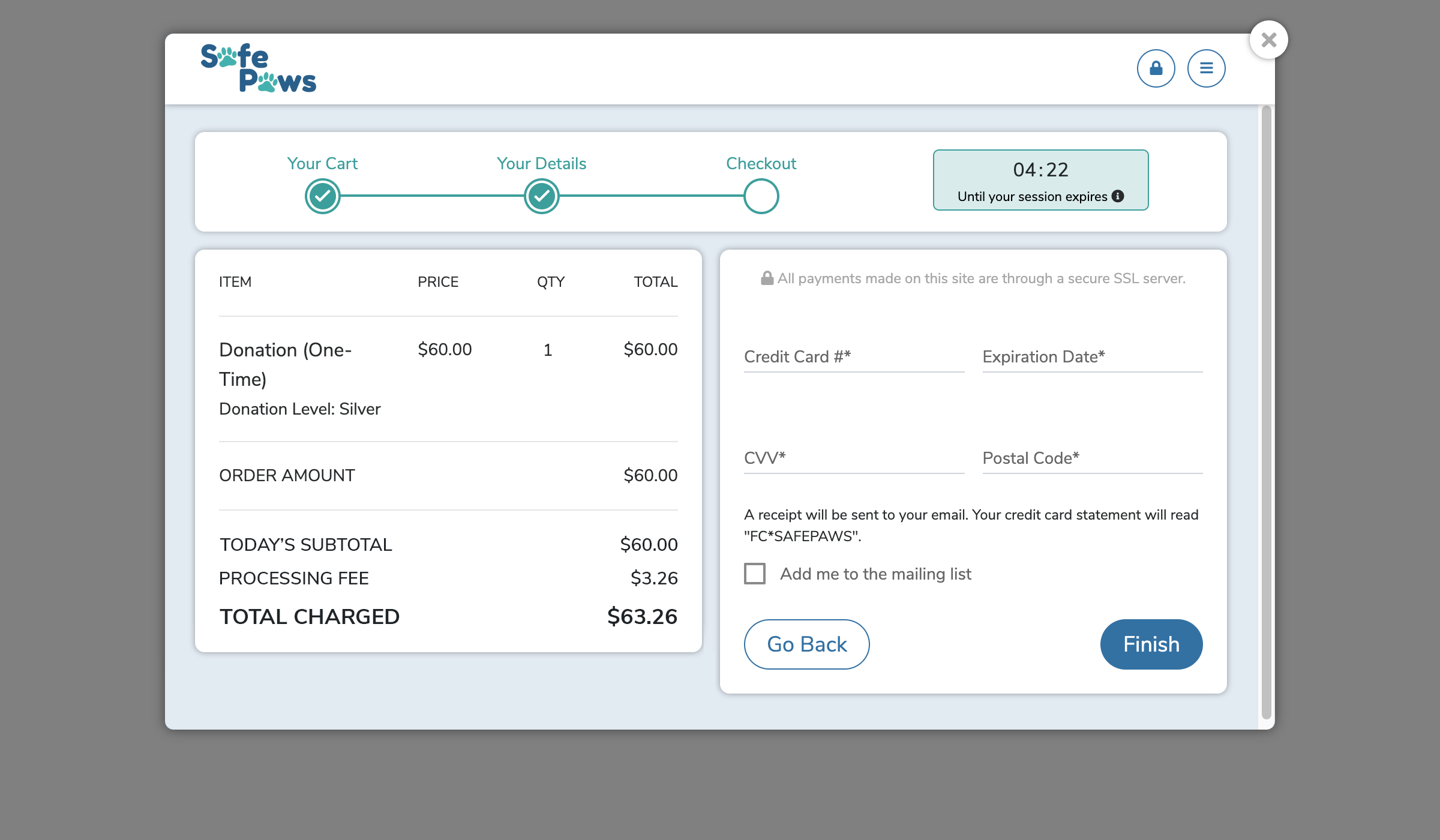
Widget review/checkout page

Widget transaction confirmation page
Phase 2 — Second Redesign
The second redesign of the Widget was not officially launched, although the creation of a Design Systems Library in Figma for the second Campaign Websites redesign allows for an easy imaging of what it could be.
The second widget redesign, using components from the newer Design System Library