
Flipcause User Dashboard
The user Dashboard is where the Campaign Websites and Widgets are configured, as well as where nonprofits can manage their funds, contacts, reports, and account settings. From the Dashboard, users can create new campaigns using any combination of engagement tools, generate integration codes for widgets, compose manual transactions, run reports, withdraw funds, set up data collection, message supporters, and customize receipts. The platform is robust with a vast number of settings.
Phase 1 — Original Version
Background
The Flipcause Dashboard is a platform for nonprofit fundraising and engagement. When I started at Flipcause in 2014, the Dashboard was in its beginning stages, allowing users to create basic campaigns and withdraw funds. Between 2014-2022, I helped build out the Dashboard to include the many additional features it has today. This includes expanding the campaign tools and functionality, building widget settings and configuration, creating manual payments and text-to-give, and producing a contact database.
Problem
We aimed to provide an all-in-one fundraising platform for growing nonprofits. This platform would need configuration settings for the Campaign Page and Widget, as well as the ability to withdraw funds, enter payments manually, collect data, run reports, keep track of activity, and message supporters.
Process
Role
The team working on the initial product was the CEO, the CPO, and the Product Designer (me). Using research conducted by the CEO and CPO and wireframes from the CPO, I created high-fidelity prototypes and worked with engineers to test and bring the product to life.
I sketched, wireframed, and prototyped several additional major Dashboard features from scratch, such as the Integration Center, Manual Payments, Text-to-Give, and Webhooks. I also continuously worked on smaller updates, fixed design bugs, and initiated design improvements over the years.
Users
Customer Success Reps
Unlimited human support is one of the main tenants of Flipcause. Nonprofits will often take advantage of concierge services for campaign creation, making Customer Success Reps our primary users.Small, growing nonprofits with limited resources
Our customers generally held non-technical roles, such as Marketing Manager, Accountant, or Founder.
Challenges
We needed to develop complex functionality to accommodate a wide range of nonprofit needs, which could be difficult for non-technical users.
Our startup team was lean, with limited resources, and we had to develop quickly to establish funding.
Research
The CEO and CPO conducted industry research to determine the tools needed for nonprofit success. Along with a small Customer Success Team, they interviewed a growing customer base to survey them on their needs. As we built the product, we continuously sought feedback from our in-house Customer Success team as well as a subset of beta users who were our customers. We gathered the following information:
Nonprofits want to collect donations/payments, run events, sign up volunteers, sell merchandise, collect sponsorships, and enable peer-to-peer fundraising.
Engagement tools should be robust to accommodate a variety of needs.
The design of the Campaign Page and Widget should be highly customizable.
Growing nonprofits are often understaffed, need technical support, and do not have time to learn new technology. Some do not even have their own website, logo, or branding.
Approach
To help with the steep learning curve, we offered and encouraged unlimited support from the Customer Success Team.
We adopted a friendly, large, iconographic, and colorful visual approach to suit a nontechnical user.
We developed a Campaign Wizard to create a simple campaign in two clicks.
We offered a website creation service to customers (through Weebly) to provide them with a website that could integrate with our tools.
Results
The Dashboard is used by over 5,000 nonprofit customers today. Nonprofits have collectively raised over $1,000,000,000 (1 billion) using a combination of campaigns and manual payments that are configured from their Dashboards. 5 million transactions have gone through Flipcause’s system, and the average user maintains 6 active campaigns.
Below you can review some sections of the Dashboard, which is over 90 pages in total. Over the years, many features have been added since its initial release, but its design has remained the same.
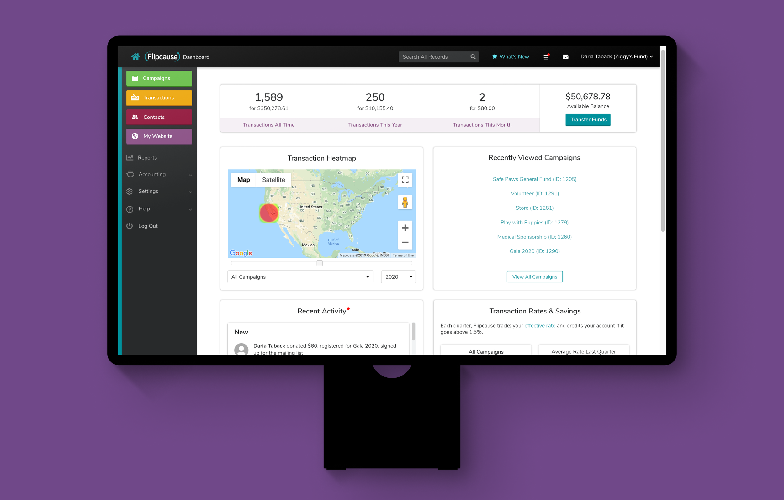
The Campaigns page, where users can edit campaigns
Manual Payments
Below is the Manual Payments section, where users can generate transactions for their campaigns from the user Dashboard. This is especially useful for logging cash, checks, and over-the-phone donations. This transaction flow allows users to add activity to any active engagement tool (donation, registration, volunteer, store, or sponsorship) and associate it with a contact from their database. It accounts for about 6% of transactions through the Dashboard.
In collaboration with the Product team, I designed this section of the platform and worked with the engineering and QA teams to execute it on our servers.
To see a video walkthrough of Manual Payments, click here.
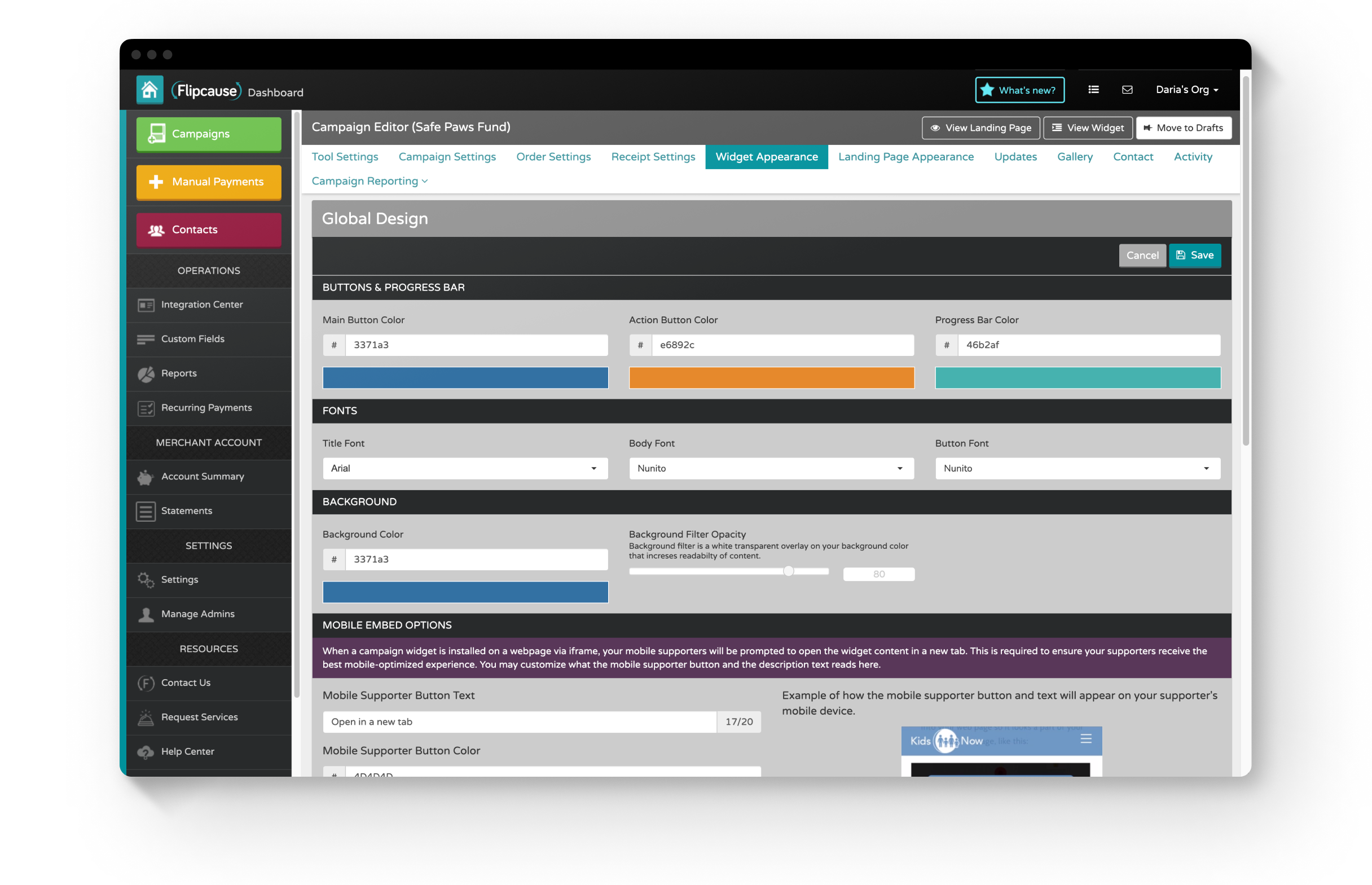
Widget Appearance settings, where users can configure colors, fonts, images and display settings for their widget

Each Registration Group added allots Registration Types, which are more granular categories the user can set up for their event
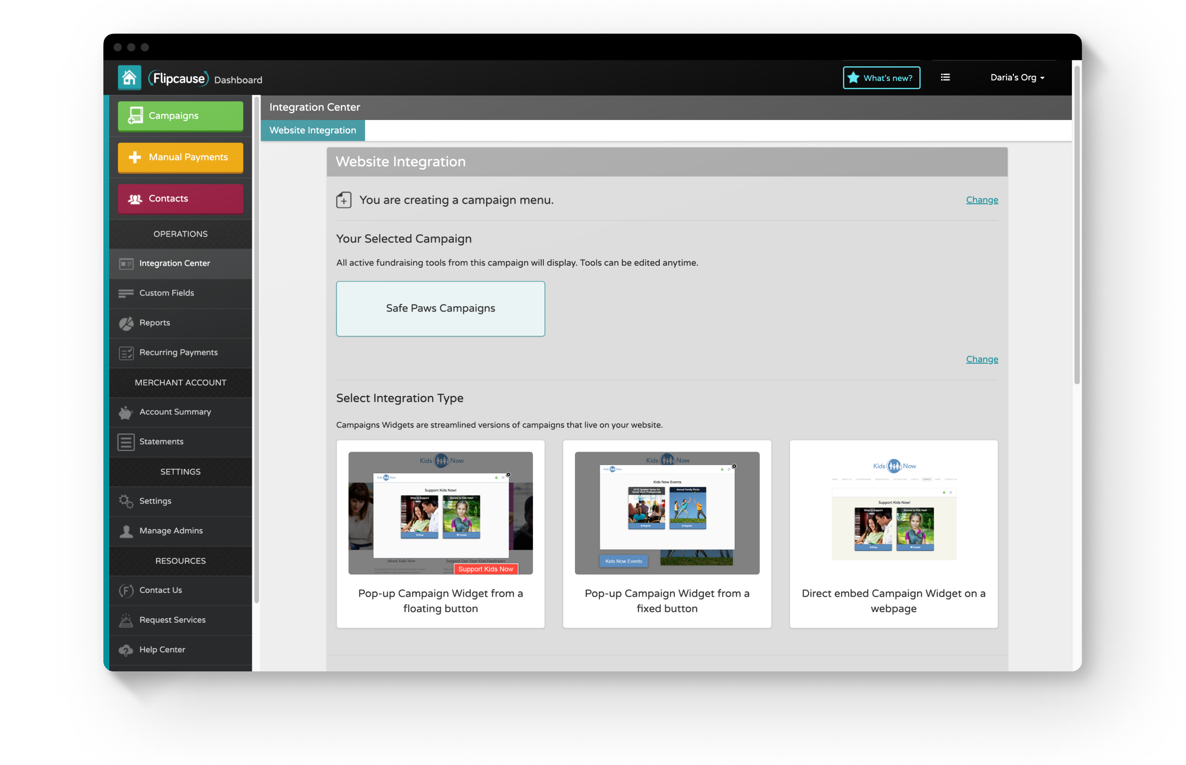
The Integration Center, where users can generate code to integrate the widget into their website (as a pop-up from a button or as an embed)
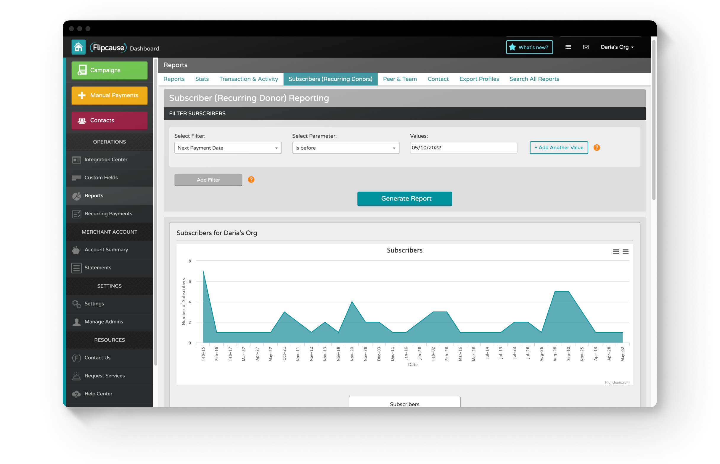
Subscriber Reports, one of the many reporting sections of the Dashboard

In SMS Settings, also known as Text-to-Give, organizations can set up codes that supporters can text on their phones to get easy access to a campaign or website
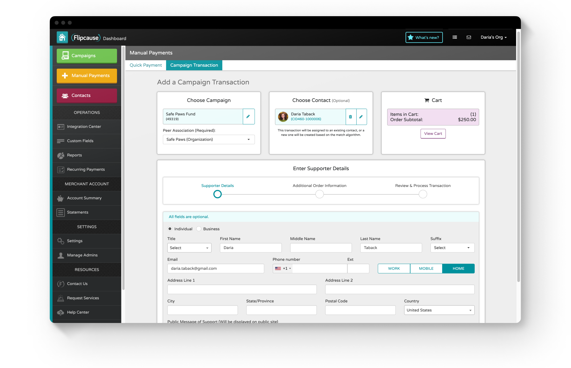
Manual Payments, supporter details page (all fields are optional as the organization is choosing whether or not to collect it)

Manual Payments, checkout page — cash, credit, or card are accepted
Phase 2 — Dashboard Redesign
Background
In 2020, the Product team initiated a full redesign of the Dashboard to make it more intuitive and easier to navigate despite its complexity. Since the product had been built piecemeal over many years as the company established itself and its services, the Dashboard also needed a consistent and modernized design system and UI library, which is something our team sought to solve. This project phase served as a major proposal to the executive team.
Problem
The User Dashboard is big, complex, and loaded with functionality. It is set up with a deep navigation structure to handle nested features. The learning curve is steep, and customers often rely on Success Representatives to build campaigns for them. Our team aimed to ease the burden on Success Representatives and make the product more intuitive to navigate while also updating the product language and the UI to be clear, consistent, and modernized.
Process
Role
I worked as the only designer on a team of 3, which consisted of the Technology Director, Lead Product Manager, and Lead Product Designer (me). I conducted research for the project, as well as sketched, wireframed, and created high-fidelity, interactive prototypes. I iterated with feedback from my team and stakeholders. I also co-led a presentation to the executive team to pitch the development of this project.
User Dashboard Sitemap Restructuring
We analyzed and reorganized the Dashboard sitemap for clearer organization and a more intuitive user flow. In the sitemaps below, I used Flowmapp to draw out a new site structure.
The User Dashboard sitemap, current
The User Dashboard sitemap, reconfigured
Personas
We identified our main users for the product in order to understand our users’ needs, experiences, behaviors, and goals. We focused on 2 main personas: our clients (a representative from a nonprofit, typically non-technical), and Flipcause’s Success Reps, who are trained in Flipcause software and work closely and regularly with nonprofits to build their campaigns.

Barbara (Client)
Goal — to be capable of picking up where she left off without missing a beat
Needs — to feel confident using Flipcause, but also knows she can rely on her Success Team

Anthony (Success Rep)
Goal — to help clients complete tasks as quickly as possible
Needs — a simple navigation system to get around Flipcause so he can better serve his clients
Preliminary Research
I worked alongside the Lead Product Manager to collect research through interviews and listening in on client support calls. We chose to interview Success Representatives, as they are the primary users of the Dashboard, they work directly with nonprofit users, and they can easily identify pain points and requests.
During our interviews, we had Success Reps walk us through the current Dashboard to review strengths, pain points, and more frequently trafficked areas. Since the Dashboard is vast, we focused on 3 sections: the Homepage, Campaigns, and creating and editing a Registration Group. Below are the main pieces of feedback we collected on these sections.
Homepage
Would like an easy way to access recently edited campaigns
All Campaigns
Would like better sorting options to reorder campaigns
Registration Tool
Too many clicks when trying to edit a Registration Type
Advanced Settings always gets overlooked
Decisions
Focus: Navigation Structure
To reduce clicks and help users get to where they want to go more quickly, we focused on simplifying the Dashboard’s navigation structure, which was 7 layers deep. There are the changes we made with that goal in mind:
We reduced the navigation to 4 tiers, reducing horizontal tabs and clutter.
The navigation levels are hidden as the user clicks into deeper levels to reduce unnecessary information.
A floating bar with Save and Revert Changes functionality was added to allow users to save their progress without having to scroll to the top or bottom of the page, and there are no more restrictions on editing multiple sections at once.
We added a “Recently Viewed Campaigns” linked list to the Home page.
Focus: Campaign Editor
We sought to make editing within the Campaign Editor easier to navigate, as well as to optimize the sorting functionality of campaigns and tool groups. With that in mind, we made the following changes:
Search and sorting functions were improved by placing all campaigns into a single, open container.
We implemented drag-and-drop functionality for the precise sorting of campaigns and tool groups.
We improved product language on action buttons.
We reduced clicks by adding expandable tool groups that list and link to each tool type directly.
We also reduced clicks by providing links to each active tool in the sidebar navigation, when previously users had to first click on a Tool Settings page to access a different tool.
We updated the UI of the Advanced Settings section to be more prominent.
Results
I built the prototype using Sketch, Adobe CC, and Invision and focused on the areas of research to start: the Homepage, the Campaigns page, and the Tools Settings. The Product team then presented the project to the Executive Team for approval, where it was approved to go forward. However, other business priorities ultimately put this project to go on hold.
Below is the revised home page and campaign editor. Click here to view the prototype on Invision, or click here for a video walkthrough of the prototype.
The still here shows the redesigned Dashboard home screen, which now includes Recent Campaigns links and an Activity section.
Below is the redesigned Campaigns page, with a new campaign card style and dropdown filters instead of accordion sections. Campaigns can be sorted between published, drafts, and archived via drag and drop.

A campaign card on hover — Edit and View Widget / Campaign Website become visible, while Clone, Move to Drafts, and Delete are options beneath the ellipses

The Tools Settings has been updated with clearer, modernized icons, and each fundraising tool can be activated or deactivated in the same section

The Registration Groups page now includes a feature to toggle down and directly view and link to Registration Types. Published groups, drafts, and archived groups can be selectively viewed by a dropdown selector and sorted between categories by drag and drop

The individual Registration Group page is simplified and reorganized into 2 even columns

The Registration Type section is neatly reorganized and updated with consistent components

Donation preset levels are now reorderable by drag and drop, and are stacked in 2 rows of 3 for more efficient screen real estate

Elements on the Peers page are neatly stacked for clarity, with updated and consistent components and action items
Fiscal Sponsors Dashboard
Background
The Fiscal Sponsors Dashboard was developed for nonprofit customers that sponsor charitable projects that do not have a 501(c)(3) status. These nonprofits (known as fiscal sponsors) can receive donations on behalf of these projects and distribute funds to them.
Using the Fiscal Sponsors Dashboard, fiscal sponsors can collect and distribute funds, conduct batch transfers, and run reports on their projects’ financing. Each project is granted its own Flipcause Dashboard account, which fiscal sponsors can access to help build project campaigns. If you are a fiscal sponsor customer at Flipcause, you can switch between your Fiscal Sponsor Dashboard and User Dashboard in the upper right corner.
Process
Research
Collaborating with the Customer Experience and Sales teams, my team interviewed fiscal sponsor customers of Flipcause and gathered data on their needs, which primarily focused on accounting. We worked extensively with two primary customers, meeting with them in person and gathering their feedback.
Users
Fiscal Sponsors
Collect and distribute funds to charitable projects
Need accounting tools to transfer funds and generate reports
Role
The Product Team—a Tech Director, Product Manager, and Product Designer (me)—built this dashboard in collaboration with engineers and other stakeholders. Our team worked together on ideation, sketching, researching, and testing.
As the Product Designer, my role was to adapt these sketches into wireframes and interactive prototypes. I iterated concepts with my team until they were approved by stakeholders, which included key customers. I conducted quality assurance testing as the dashboard was engineered on our servers and designed feature updates as needed.
Results
Below are samples of the resulting Fiscal Sponsors Dashboard, which has been used by 8 fiscal sponsors since its creation (and counting). These fiscal sponsors service around 700 charitable projects combined.
The home screen opens to Project Management. From here, fiscal sponsors can log into their user Dashboard or the Dashboard of any of their sponsored projects. They can also request new project accounts and deactivate existing project accounts.
Click here for a video walkthrough of the Fiscal Sponsors Dashboard.

The Account Summary, where users can conduct transfers of funds

Mass Transfer overlay

Global Settings