Live Donation Mobile App
The mobile app, Flipcause Live, allows organizations to collect payments and check in participants at live events. Payments can be associated with a campaign set up on the Dashboard, or can be collected independently of any campaign. The app is used on mobile and tablet, and payments can be processed and logged through card, check, or cash. In previous versions, the app was coupled with a card reader. Data collected through the app syncs with users’ campaigns, reports, and contact database.
Background
The mobile app was originally designed and developed 2017 by a Product Manager and Product Lead while I was on leave from Flipcause getting my MFA in design. While I was not a part of the original design and development of the app, I did contribute to small feature updates such as syncing and online/offline states displays, as well as asset updates and bug checking. When I returned to Flipcause, I angled to redesign the app as it looked very dated and was a confusing product to use. As a new user to the app, I found it difficult to complete a transaction given button placement and unintuitive indicators for selecting payment types.
In 2020, I launched a redesign for the app, bringing in a consistent, coded icon library set, systematized UI elements, updated tools icons, and a reconstructed user flow. While working on the design, I worked directly with an app developer to determine what was possible within the React framework, and we collaborated to create the first three screens on a test build. The project got tabled as other company priorities emerged.
The original version of the Flipcause Live mobile app, showing the Home screen, the Sidebar Menu, and the first page of the Add New Payment transaction flow. Click here to view a walkthrough of the app.
Mobile App Redesign
To redesign the mobile app, I took to task two issues presenting the original: confusing user flows (leading to less successful transactions), and clunky, inconsistent UI that made common signifiers less intuitive. Below is a map of the transaction flow reconfigured for the new design, which systematizes the payment options and reallocates the Payment Profile to its own page, so it does not interfere with the continuation of a transaction. In the wireframe below, icon and button placement has been evaluated and repositioned for easier use and uninterrupted top-to-bottom movement. Breadcrumb steps have also been introduced into the transaction flow so users will have a sense of where they are in the checkout process.
App redesign user flow, streamlining payment option steps and moving the Payment Profile into its own page for an easy checkout process
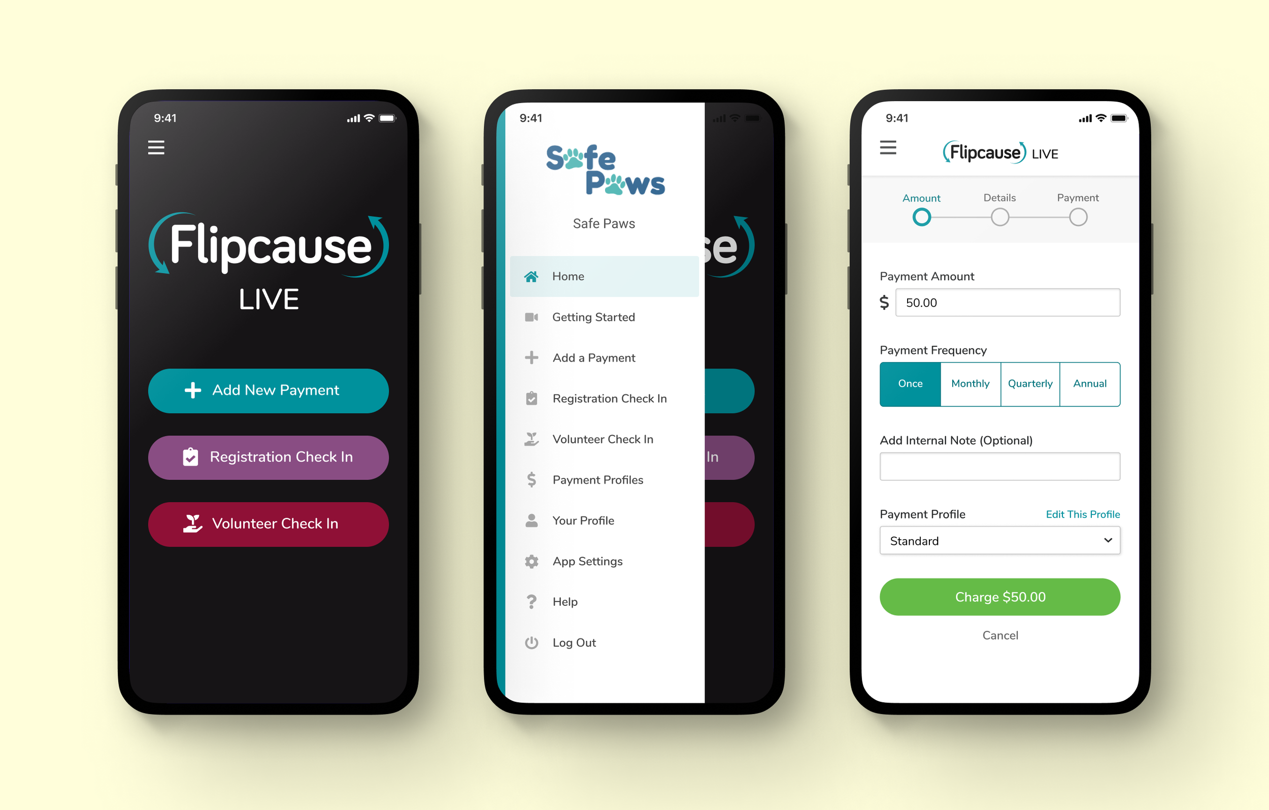
The app redesign wireframe shows an improved placement of the close button on the sidebar (the interior space of the overlay). It also keeps the action button on the Add a Payment page at the bottom of the screen so that users no longer have to navigate to the top of the page to continue to the next step. Additionally added are breadcrumb step indicators so users can know where they are in the checkout process.
The redesigned Home, Sidebar Menu, and Add Payment screens of the Flipcause Live app. Here you can see consistent and modernized UI elements, including new tools icons for clarity (the “Volunteer Check In” icon is much more legible here). See the start of the project on Figma here.


